Lunova is a Dutch kitchen furniture brand that brings affordable luxury to its customers’ homes, redefining the idea of fresh start and modern elegance. Launched out of a desire to transform the kitchen installation experience into a personalized and friendly interaction, Lunova emphasizes customization, craftsmanship and the ability to meet the unique needs of each customer.
The business challenge
Lunova operates in a competitive market, addressing a diverse audience that wants a personalized, functional and modern kitchen space. The brand aims to appeal to two main segments – those who have recently purchased a home and the mature audience aspiring to refresh their living space.
The main challenges identified were the construction of a visual identity that reflects the values of affordable luxury and personalization and the creation of a friendly and approachable communication tone that inspires professionalism with the aim of strengthening a sustainable business model that facilitates both direct interaction with customers (mobile showroom), as well as an expansion towards a network of fixed showrooms.
The branding solution
We started with a detailed analysis of the market and the aspirations of Lunova’s founder to identify the key aspects that can form a solid foundation for future expansion. The brand aims to be perceived as a reliable partner, able to listen to customers’ needs and offer them customized solutions, without compromises in terms of execution and material selection.
Lunova is defined as a choice for those who want a “fresh start” in their kitchen, combining minimalist aesthetics with functionality and comfort. The brand is positioned in the middle to high-end segment, offering affordable luxury to customers who appreciate quality details.
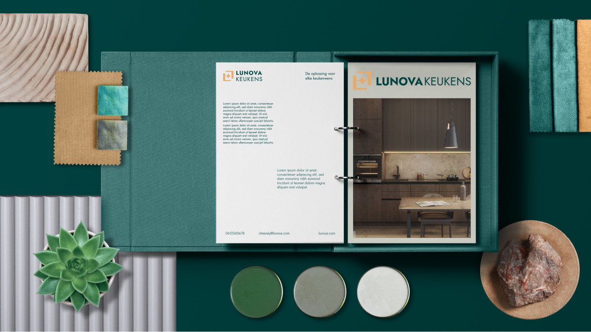
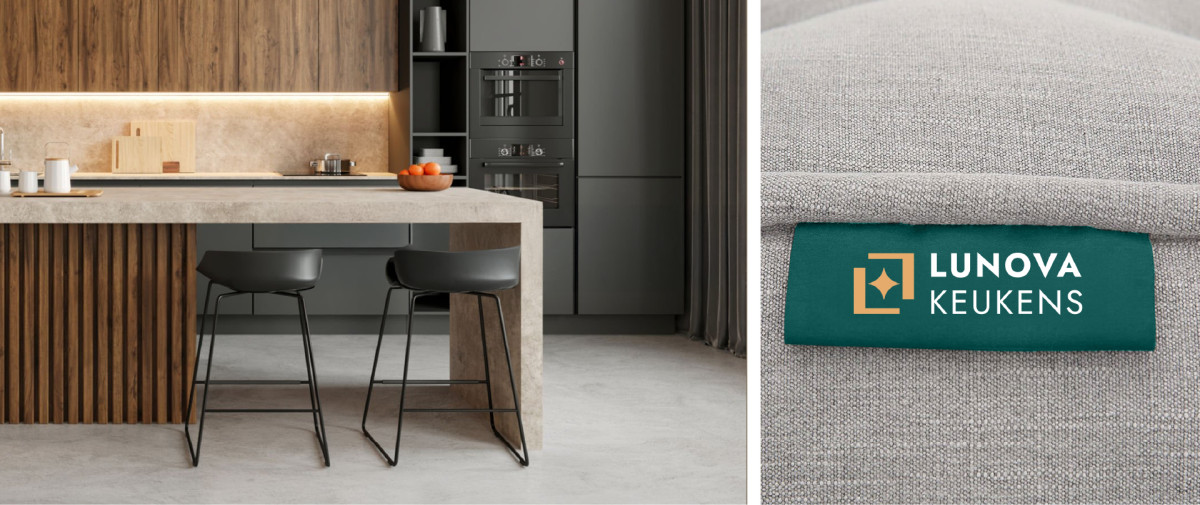
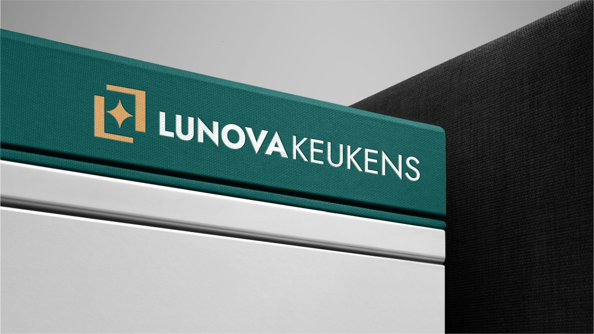
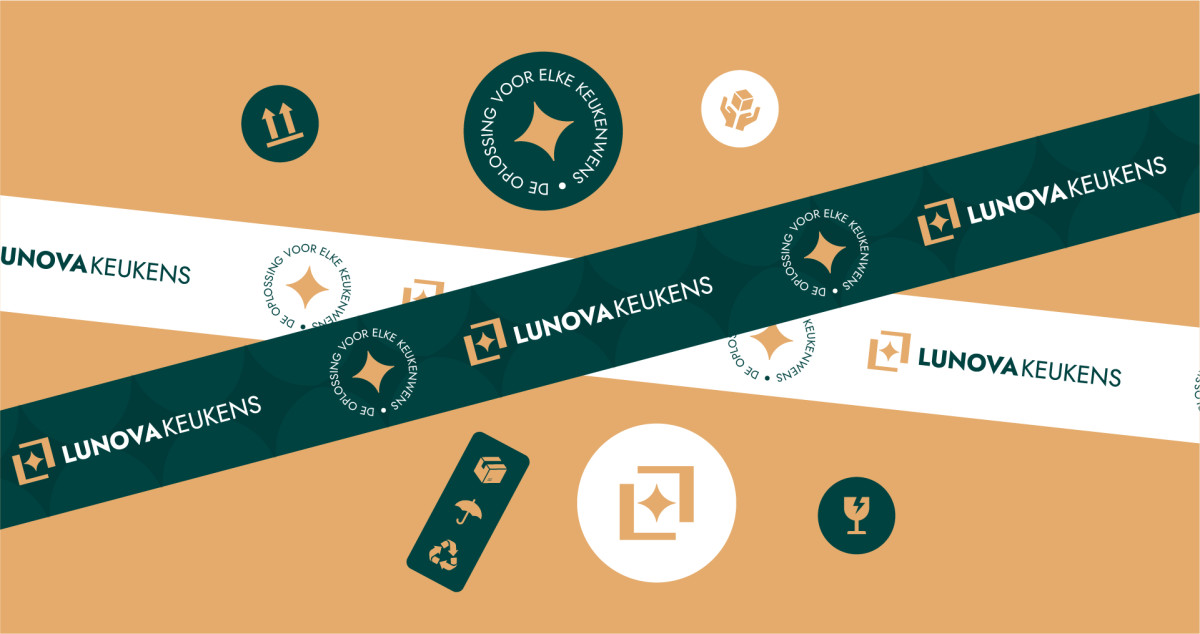
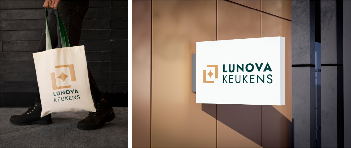
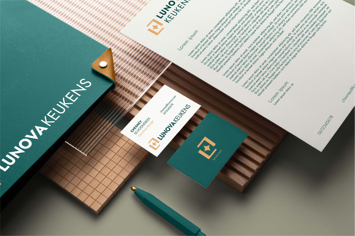
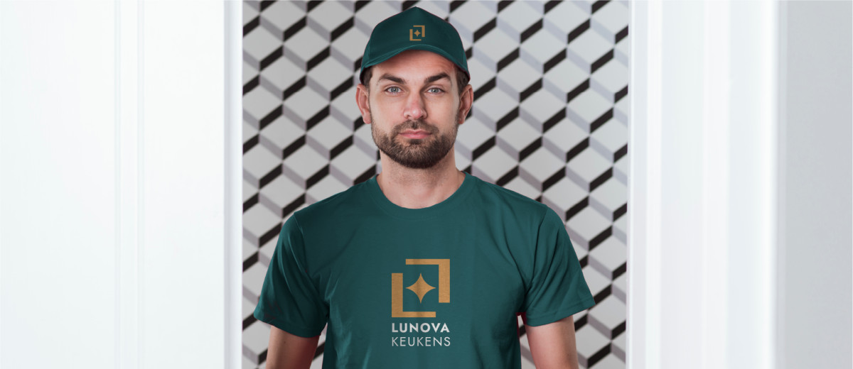
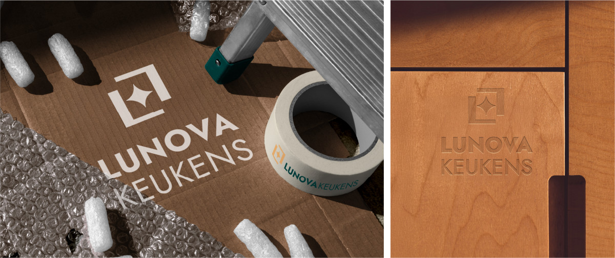
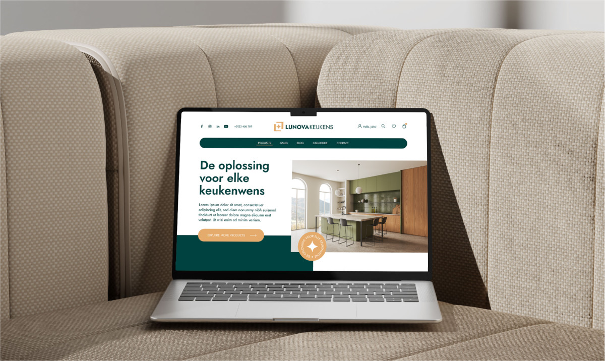
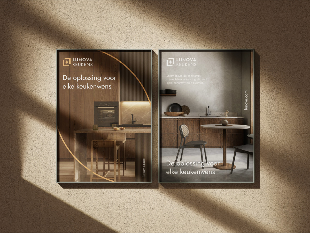
The name Lunova derives from “lumen” (light) and “nova” (new), evoking the idea of a fresh and bright space. The colors chosen – dark green and a warm golden beige – reflect the balance between modernity, naturalness and luxury. The designed logo, a minimalist and memorable one, has in the center a symbol that suggests a new beginning and the finesse of a job well done, subtly using the letter L in the name. This is supported by a clean and contemporary font that adds a friendly and approachable touch.
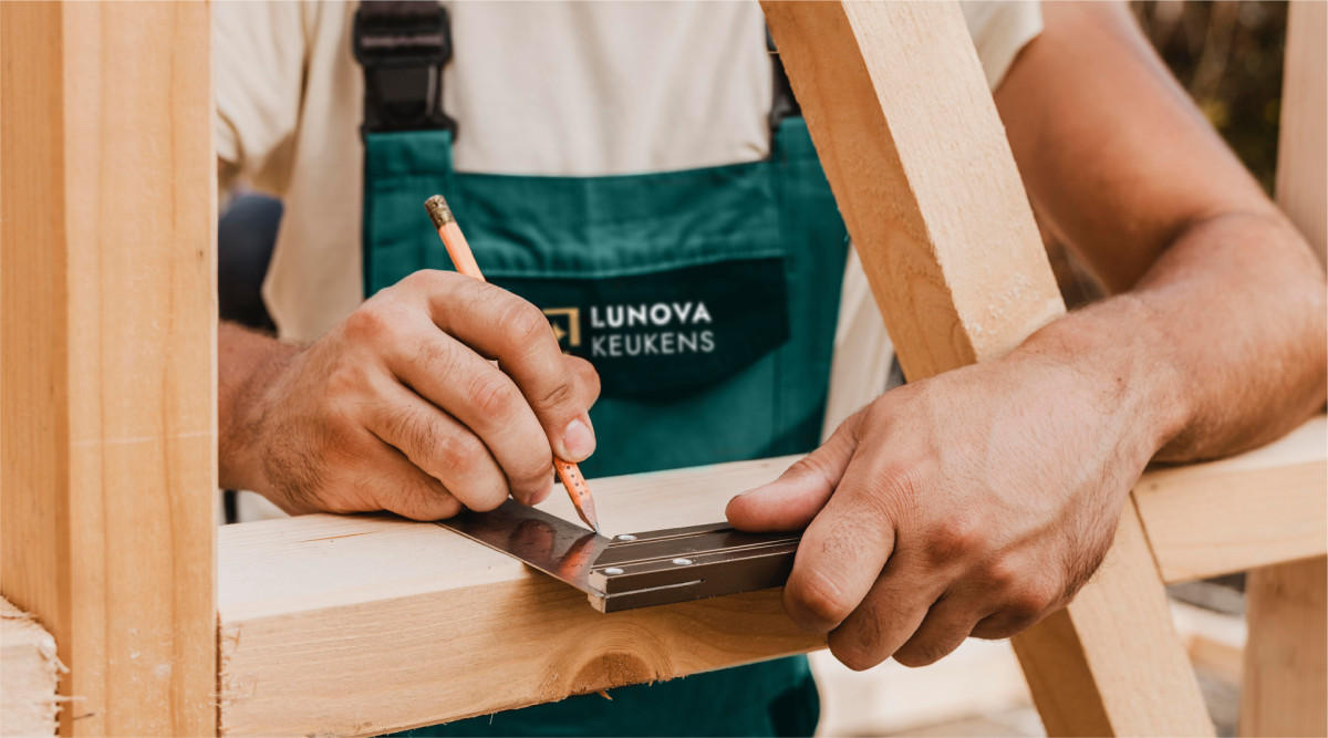
To strengthen the emotional connection with the audience, Lunova builds its communication around the value of craftsmanship – respect for details, active listening to the customer and delivery of tailored solutions. Through a mobile showroom, the brand contacts customers directly at home, bringing product samples to provide a personalized experience.
Brandfusion: Ștefan Ferencz (Brand Design Director), Adrian Boc (Digital Brand Manager), Elena Dumitru (Brand Designer.
Lunova: Chesney Schoonebeek (General Manager)
Source: www.iqads.ro


