Who would have thought that one day, freely placing your icons on an iPhone would be possible? With iOS 18, Apple finally breaks the chains of rigidity and gives users unprecedented control over their home screen.
The year 2024 was shaping up to be a year full of innovations for Apple. All eyes were on the iPhone 16, the Apple Vision Pro that was supposed to revolutionize mixed reality, and Apple Intelligence, Apple’s long-awaited AI revolution.
And then, discreetly, almost on the sly, Apple unveiled iOS 18. At first glance, nothing revolutionary: yet another update to the mobile operating system.
But looking more closely… I have to admit that I was wrong. In June 2024, I wrote: It’s ugly, looks like Android ».
I was talking about iOS 18. I mentioned the advanced customization… and I concluded: We must not go to excess either.
To go further
iOS 18 is here: 6 new features to try right now
Since the launch of the iPhone in 2007, Apple has always favored a minimalist and controlled approach to the user interface.
This philosophy, anchored in the company’s DNA, aimed to offer a consistent and intuitive experience to all users. Even if I didn’t adhere to this concept, I understood. However, in recent years, and especially with iOS 18, we have been witnessing a paradigm shift.
Customization has long been iOS’s Achilles heel compared to Android’s flexibility.
Year after year, iPhone users have demanded more control over their home screen, more freedom in how they arrange their apps. Apple has resisted, arguing that its design philosophy ” opinionated » ensured a consistent and intuitive experience. But times change, and with them, Cupertino’s strategy.
A historical look back at iOS customization
- 2007-2012: era of absolute rigidity. No customization possible apart from the wallpaper.
- 2013 (iOS 7): Introduction of the “Parallax Effect” and dynamic wallpapers.
- 2017 (iOS 11): arrival of the customizable Control Center.
- 2020 (iOS 14): Home screen widgets and ability to hide app pages.
- 2022 (iOS 16): Advanced lock screen customization.
- 2024 (iOS 18): complete revolution of the home screen.
This development shows how Apple has gradually opened its system to user requests for customization, while maintaining a certain level of control over the overall experience.
The great upheaval
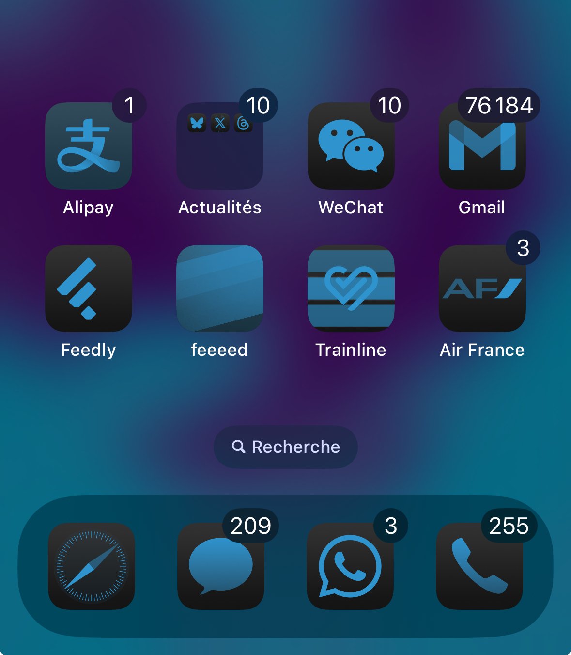
With iOS 18, several things have changed. For the first time, Apple fully embraces the concept of advanced customization. The free placement of icons, long considered heresy in the Apple universe, finally becomes a reality.
From a technical perspective, this change is much more complex than it seems. The rigid grid system that has underpinned the iOS interface since its inception had to be completely rethought.
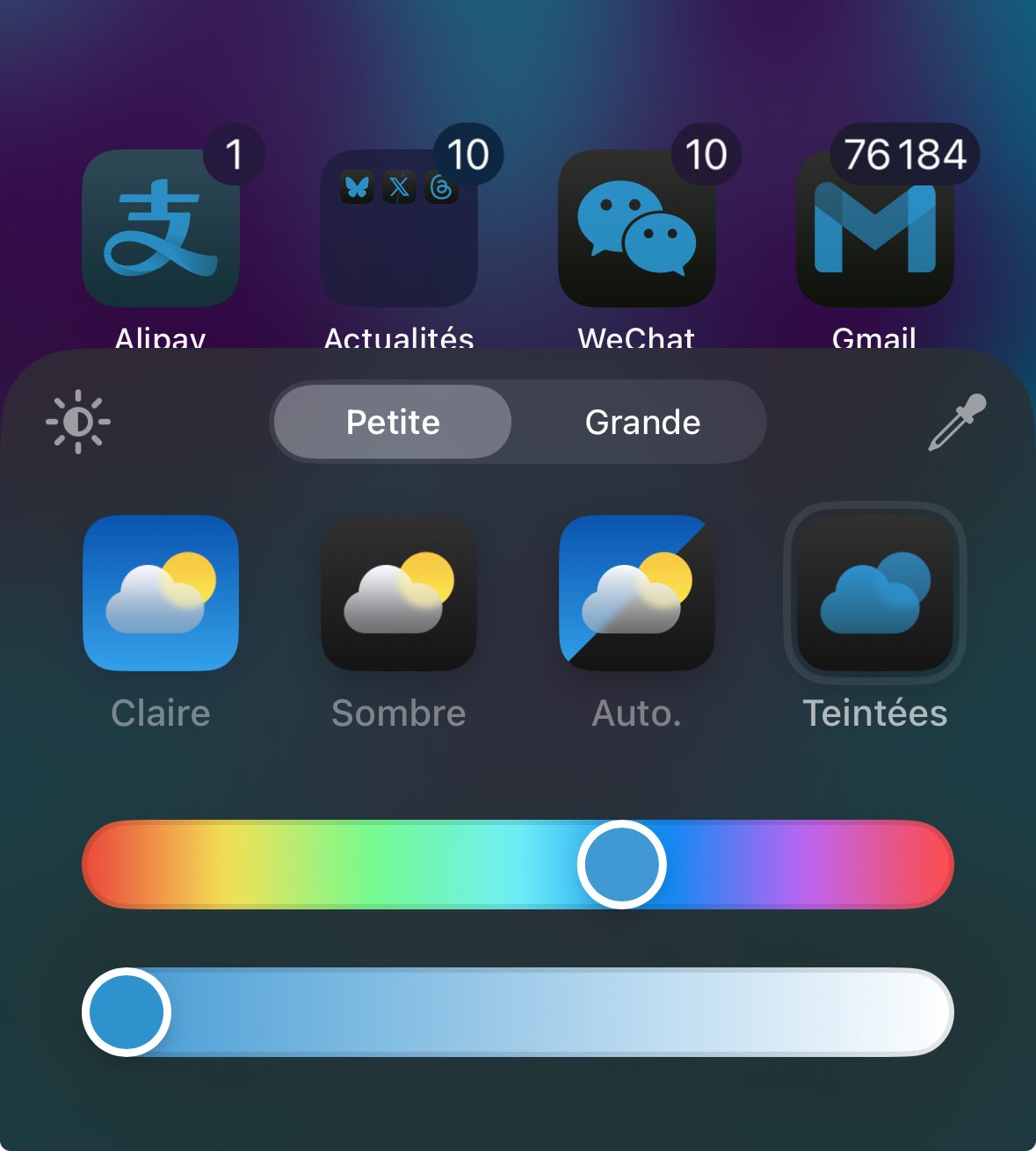
But Apple wouldn’t be Apple without adding its own twist to this newfound freedom. The unified hue system introduced in iOS 18 is a technical tour de force.

In real time, the iPhone analyzes the dominant colors of your wallpaper and applies a harmonious shade to all of your icons.

The result is convincing, I must admit: a home screen whose visual harmony rivals the best creations of Android aficionados, while retaining that distinctive Apple touch.
Dynamic icon resizing is another major innovation that deserves attention. By removing the text under the icons and making them larger, Apple is taking a calculated risk.
On the one hand, the interface gains in clarity and visual impact. On the other, the rapid identification of applications could become a challenge for some users. But to overcome this problem, Apple has developed a shape recognition system, capable of identifying the key elements of each icon to preserve them when resizing and applying the unified tint.
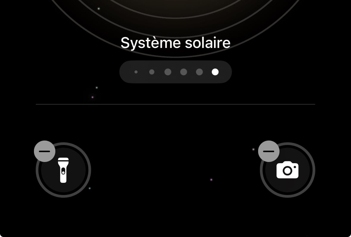
But the customization revolution doesn’t stop at the Home screen. iOS 18 also brings significant changes to the Lock screen. What am I talking about? The ability to change the quick shortcuts located at the bottom of the screen.
Gone are the days of being limited to your flashlight and camera. Now these shortcuts become true extensions of your daily workflow.

Any idea how big a change this is? You can remove the classic camera, and use Halide with a simple swipe of your finger, without even unlocking your iPhone.
This seemingly innocuous feature represents a significant change for Apple. For the first time, the company is allowing third-party apps to integrate so deeply into the core iPhone experience.
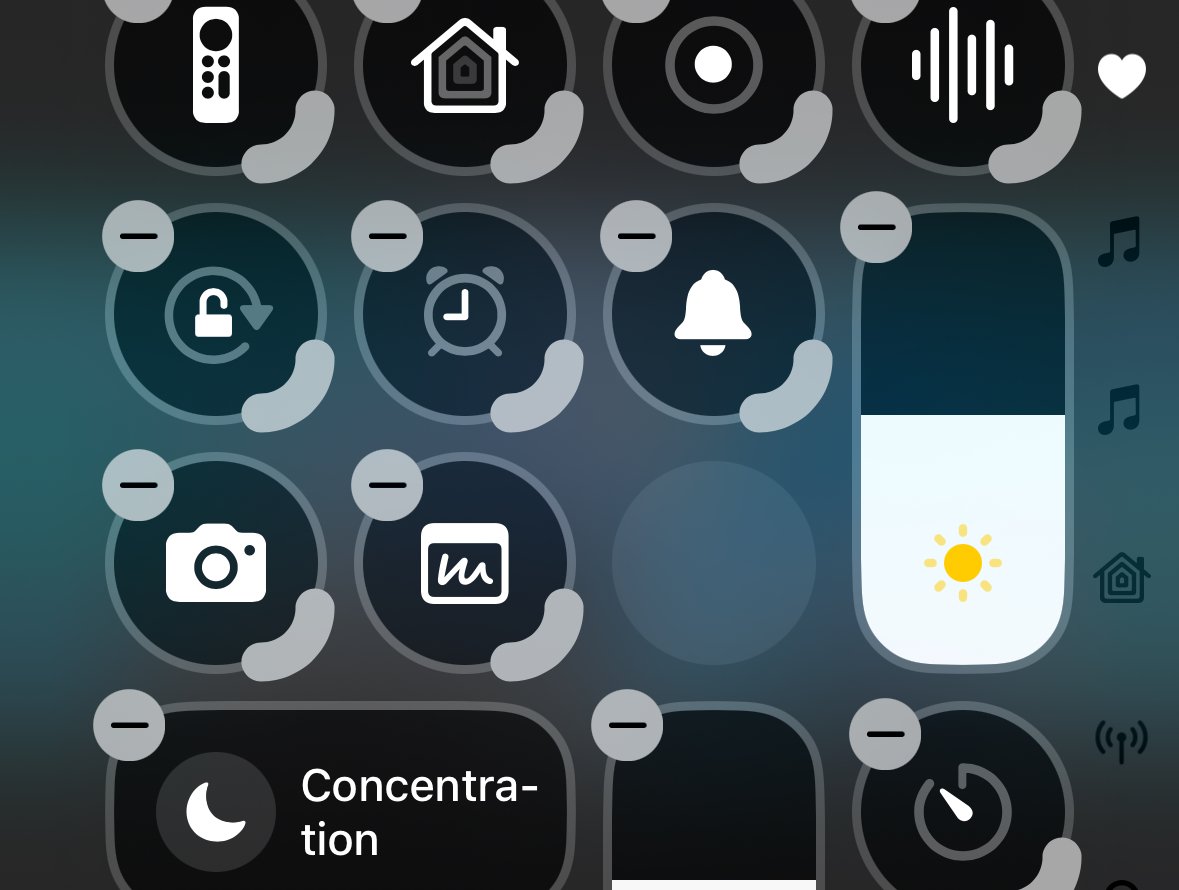
But my favorite part might just be the new Control Center. Long considered a mere utility panel, iOS 18’s Control Center becomes a fully customizable cockpit.

Every button, every slider, every shortcut can now be added, removed, or rearranged according to the user’s preferences. This flexibility is reminiscent of what Android users have been able to do for years with their widgets, but Apple takes the concept even further in terms of integration and visual consistency.
To go further
iOS 18: Here’s how to customize Control Center on your iPhone (we want the same on Android)
The Control Center’s deep customization is a perfect example of how Apple is reinterpreting the concepts of customization in its own way. Where Android offers almost total freedom, often at the expense of consistency, Apple offers a highly customizable system, but always framed by strict design guidelines. The result is a Control Center that can look radically different from one user to the next, while still remaining instantly recognizable and usable.
To go further
iOS 18 installed… Here are 7 settings to make immediately on your iPhone
Apple is finally recognizing that customization isn’t the enemy of simplicity, but can actually enhance it. By giving users the tools to shape their iOS experience, Apple isn’t diluting its identity — it’s strengthening it. Because in the end, what makes an iPhone unique isn’t just the hardware or software Apple creates, but how each user makes it their own and personalizes it.
Source: www.frandroid.com


