In 2021, the American fast food restaurant unveiled its new logo. But it was only in July 2024 that it officially appeared. The opportunity for the chain to judge its old logos on social networks.
Three years. That’s how long it took Burger King France to make its logo change official. Announced in 2021, it has only been visible on the burger brand’s social networks, website and app since the end of July. “Since it’s vintage, we waited 3 years to put it in our profile picture”she mocks on the social network X.
Since it is vintage we waited 3 years to put it in PP. https://t.co/6i1d03uF9C
– Burger King France (@BurgerKingFR) July 30, 2024
Shaped like a burger and colored in the same way (or almost) as two of its previous logos, this new emblem is intended to be “simple and fun”as the company explained in a press release published in 2021.
An analysis of the 7 Burger King logos
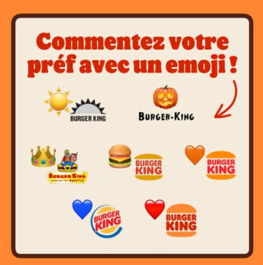
And for the occasion, Burger King decided to comment, in a self-critical manner, on all its old logos. “Since 1954, we’ve changed our look quite a few times. You know us, we’re playful. We thought we’d judge all our logos. Our favorite is the new one. What about you?”writes the brand on LinkedIn.
While the very first Burger King visual was in the shape of a sun (“1954, a visibly sunny start”), the second one had, according to the brand, a rather frightening font (“Uh, c’est Halloween ?”) and the third “too many details”. Comments “Yeah, not bad” et “Little beauty, we love it” accompany the two that followed (those that inspired Burger King for its latest logo). Finally, while a “big change” was operated between 1999 and 2024, the historic Burger King logo has therefore made its “big comeback”. “We love it”concludes the brand.
Source: www.e-marketing.fr


