There are more than 90,000 webshops in the Netherlands and that number has been growing every year since 2007. Platforms such as Shopify contribute significantly to this, because starting a webshop is very accessible. Starting a functional webshop is therefore no longer that complicated. Once the foundation is in place and the visitors are in order, it is time for the next step: improving the user-friendliness. And that can be done with smart neuromarketing techniques.
In this article I share some examples of how you can improve your webshop.
Write your own texts
Shopify Magic offers the option to write texts with AI. Very tempting, especially if you have many products. However, various studies show that there are quite a few big differences between the two. AI writes very uniformly, consistently and with a lot of structure. In addition, AI can make mistakes in strange areas. Texts written by humans, on the other hand, have more differences in sentence length, are more dynamic and vary in complexity. This means that a reader can often distinguish an AI text from a text written by a human.
The distinction is not so much the problem, but rather that a text from AI generally evokes less emotion in the reader. For products without emotional value, an AI text can work fine according to research, but if there is more emotional connection with a product, texts from people are simply better and the message comes across better.
Avoid stock photos
It is well known that stock photos are not optimal, to say the least. Yet they are still used a lot. The ‘time’ argument is often cited. Not illogical, but I will still try to opt once again not to use stock photos (or at least) as little as possible.
Recognizable and everyday
Stock photos are usually very recognizable and not unique. As in: sometimes photos are recognized. The added value of a photo is then very limited. Research shows that stock photos are viewed less often, for a shorter period of time and with less focus. This directly influences purchasing behavior.
Good photos convey the message
The best photos convey the message, are descriptive and in context (not a static object, but in the environment where it is used). A photo of a forest ranger in a forest with an electric chainsaw is much better than a static chainsaw.
The left image is not professional. The product is not clearly visible and the angle of the photo is not optimal. However, I would always advise to use the left photo over the right photo (or both of course), because it is genuine, in the right context and really shows the size and use of the product. Research and A/B testing shows that the left photo is better (more fixations, longer fixations and even better conversion) than the right photo.

You can take real photos yourself, but you can also ask your customers. For example, if you ask for a review from your customers (and possibly even offer a reward in return), why not also ask for a photo that you can use? It will do your conversion good!
Use (sometimes) reviews
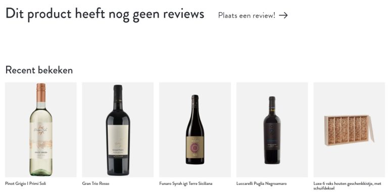
Using reviews is a good idea. Using social proof as a conversion tool and generating more trust is a proven effect. However, web shops often have many products and new websites have almost no product reviews. Showing a review option without having reviews can cause it to be perceived as new, unpopular or of lower quality than other products. This can lead to a decrease in trust in the product and the purchase intention. The good news is that with just a few reviews this can be completely reversed.
In any case: if you don’t have any reviews yet, you better not show a review option without reviews. Alternatives are showing reviews that you have as a store and not of the specific product. Or showing your own ‘expert review’ until you have user reviews.

Use Hobsons+1
Hobsons+1 effect is simple: give people an extra option outside the binary yes/no, yes/no, buy/don’t buy or continue/stop options. The theory states that the chance of something positive increases if there is an extra option outside the binary option. In practice, ‘put a product in the shopping cart or not’ will be better off if there is also an option to, for example, ‘save to wishlist’. Or in the shopping cart, where you can proceed to checkout or not. There could be an option there, for example, to complete the order later. Or to email a link to the (filled) shopping cart.

Make a distinction
In practice this also works well, but with a number of nuances. For example, make sure that there is a clear distinction between primary action (buy) and secondary action (wish list). This can be done by a different size, different color or different format (text link instead of button) or all of these.
A good style guide helps a lot with this. In addition, an extra option, such as ‘wish list’ or ‘save shopping cart’, can also ensure the collection of e-mail addresses, which in turn provides an extra entrance to approach the user relatively cheaply. Hobsons +1 can be very successful, but depending on the implementation there is certainly a difference in success.
Avoid too many expressions
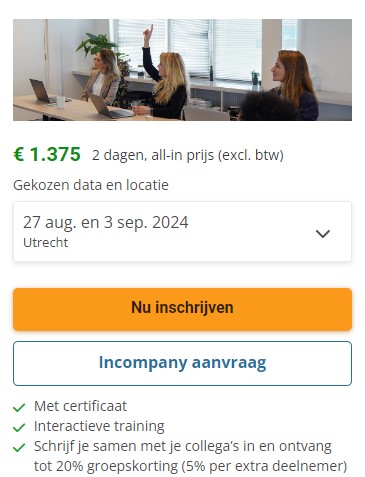
Some webshops apply all the tips. I also advise with Hobsons+1 to add something extra. The disadvantage of many theories is that a page becomes very busy. So busy that the essence is sometimes lost. So much is happening that buying something suddenly seems more difficult. In several A/B tests on busy websites it worked better to remove things. Even though everything Cialdini advises was added with good intentions.
Keep an overview
The overview and more focus on the essence works better. Sometimes even considerably better. So make sure you have a critical attitude when you add things to a page. More checkboxes with benefits, more prominent reviews and claiming your authority even more, sometimes adds nothing and only detracts. How much of what you need, differs per webshop. But the improvement is often in too much and too big. With that also too distracting.
Sometimes it is impossible to do the best for everything and you cannot avoid using the things I advise against above. Especially if you have to write extra texts, photos and your own expert reviews with many products. My advice is to take the time to improve this at least for the most popular products.
Source: www.frankwatching.com


