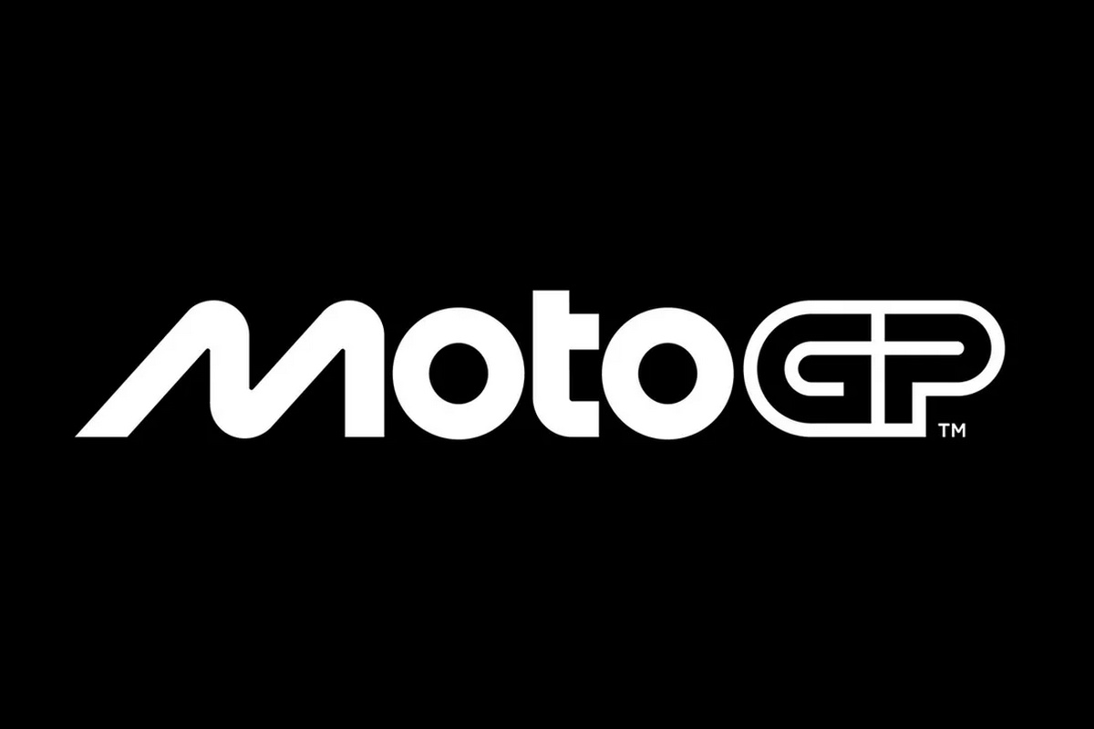
MotoGP presented a completely new logo that is at the center of refreshing the brand identity.
The famous checkered flag logo, first introduced in 2002 and further modified in 2007, was dropped in favor of a minimalist design by series promoter Dorna.
Unveiled at the National Art Museum of Catalonia in Barcelona after a weeklong run, the new logo was created by Pentagram, the world’s largest independent design studio.
MotoGP said the “M” in the new logo takes its inspiration from two bikes racing close together on a track at a banked angle. The “O” suggests the geometry of the wheels, while the “T” represents the rider on the motorcycle. The “GP” part of the design should evoke the look of a race track.
The new logo is part of a larger overhaul that includes a new visual and verbal brand identity.

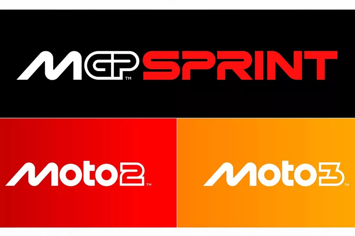
The logos for Moto2 and Moto3 have also been revised, following the same design language as MotoGP.
“We are very excited to reveal our new identity and invite fans around the world to meet the new MotoGP”said Carmelo Espeleta, CEO of Dorna.
“Working with Pentagram has been an incredible adventure that has led to what we hope our fans will agree is an amazing result.”
“The brand is more than a logo and MotoGP is more than a sport. The process has taught us a lot about both and we are very proud to show the world the results.”
“The key question was, What is MotoGP?, and now we look forward to what we want to be, and we hope that this new identity will communicate every aspect of that, from speed to passion and everything in between. This is MotoGP.”
The refresh of the MotoGP brand comes as Liberti Medjia closes in on its acquisition of Dorna, with the American company expecting to receive all regulatory approvals by the end of the year.
Formula 1, also owned by Liberty, similarly received a new logo and brand identity in 2017.

Source: www.moto-berza.com


