Hello.
We live in an era of information saturation, when we are literally overwhelmed by streams of information. Every day the number of news is such that even if you want to, it is impossible to close yourself off from them. Mobile operators were among the first to encounter the problem of information saturation among their users, when simple questions required contacting support, although the person himself could solve them in a couple of clicks in the application. But it was necessary for the subscriber to install the application, use it and find the sections he needed without difficulty. In fact, one of the key tasks of each operator has been to increase the penetration of service management applications. In the reports, operators cheerfully reported that such and such a share of the subscriber base installed the application, which gives such and such results. But if you pay attention to most of the communications, no matter what kind, marketing or regular interviews with top managers of operators, you will see that they constantly highlight certain application capabilities. People need to be made aware that they can not only manage their plan, but also get a variety of additional services and products literally at their fingertips. And here not only the operator benefits, but also the consumer of services, who can quickly solve their problems.
Last week, Beeline began updating its application, my number was included in one of the first waves, and the application was completely updated. Look how the main screen has changed.
Now the new version of the application is available to everyone, and using its example I want to look at the tasks of operators a little more broadly. In some ways, developing such an application is reminiscent of cleaning, when in a small closet you need to fit a huge number of things from all over the apartment and you don’t understand how to shuffle them so that, on the one hand, it’s convenient to get them out, and on the other hand, everything fits, it did not wrinkle and the logic of separating things was preserved. For operators, the task is much more difficult; they need to constantly talk about their services, show how they work, plus they must remember that these are not even hundreds of different opportunities, the count goes into thousands. Let’s add any of us to this task when we go to an application to solve a utilitarian problem. Can you guess why the application is opened in most cases? I think you guessed it, we need to check our balance. Much less often – connect or disconnect some services or look at the roaming conditions.
The main thing always determines the central screen of the application; you need to show the main thing. And if we look at the Beeline application, we see that they show us the name of the tariff, its cost, as well as the remaining services (for me this is traffic and minutes).
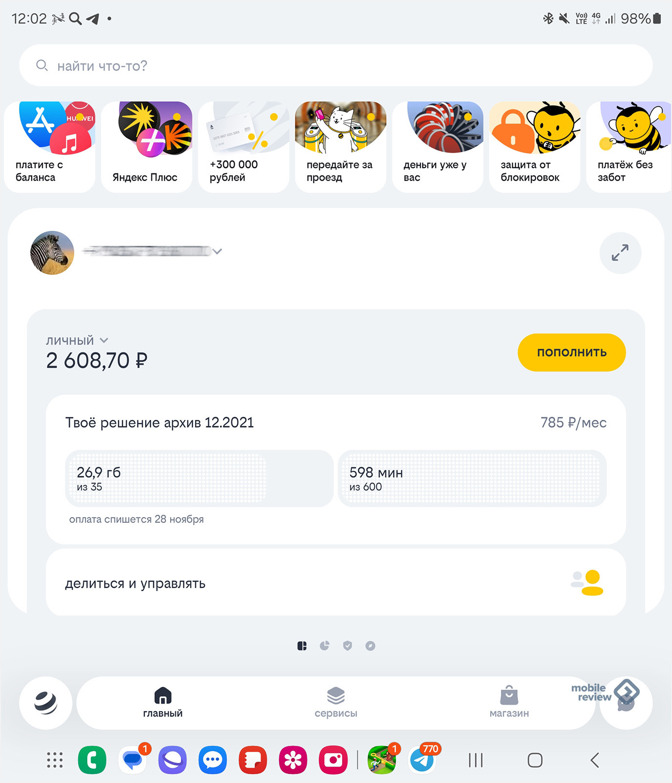
Management of tariff services is available from the same screen, plus you see the balance and can top it up in various ways.
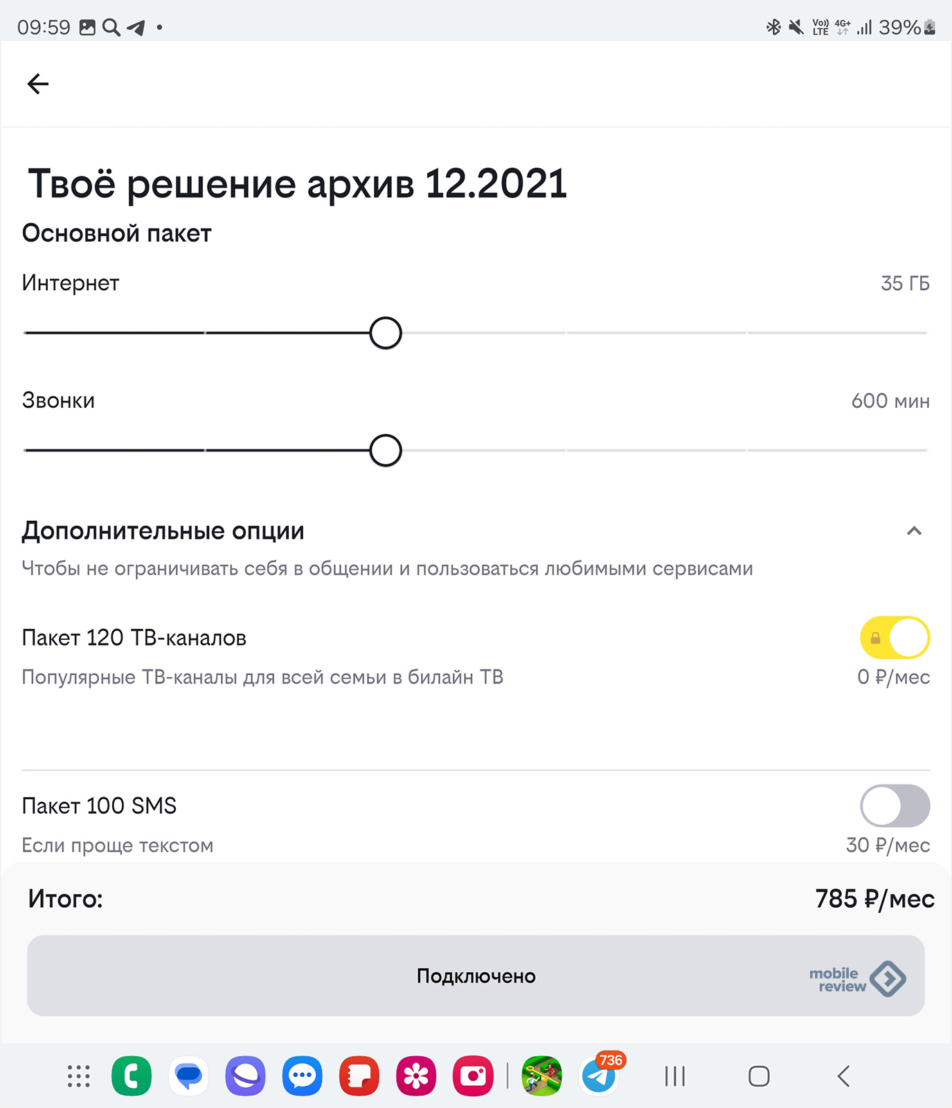
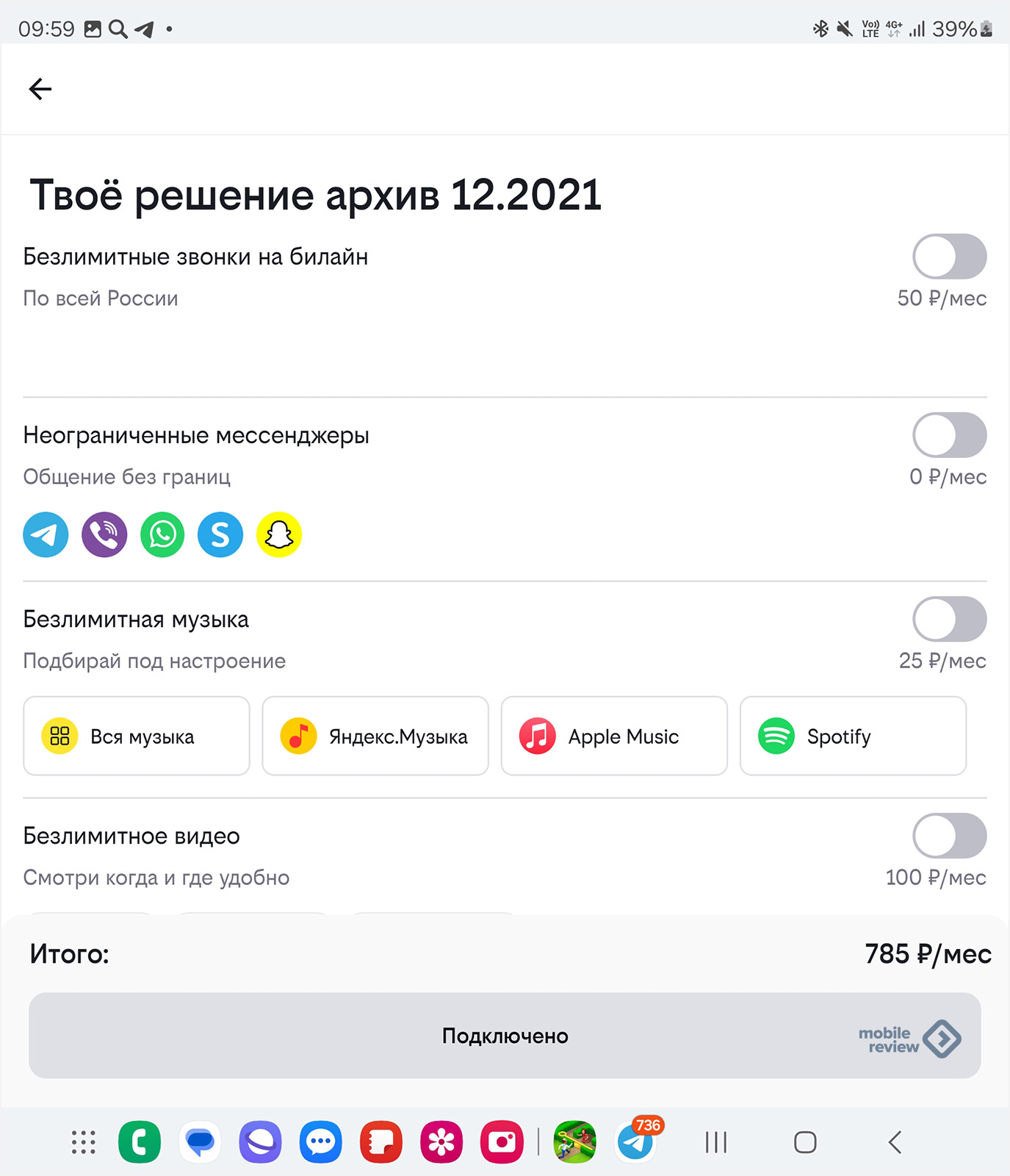
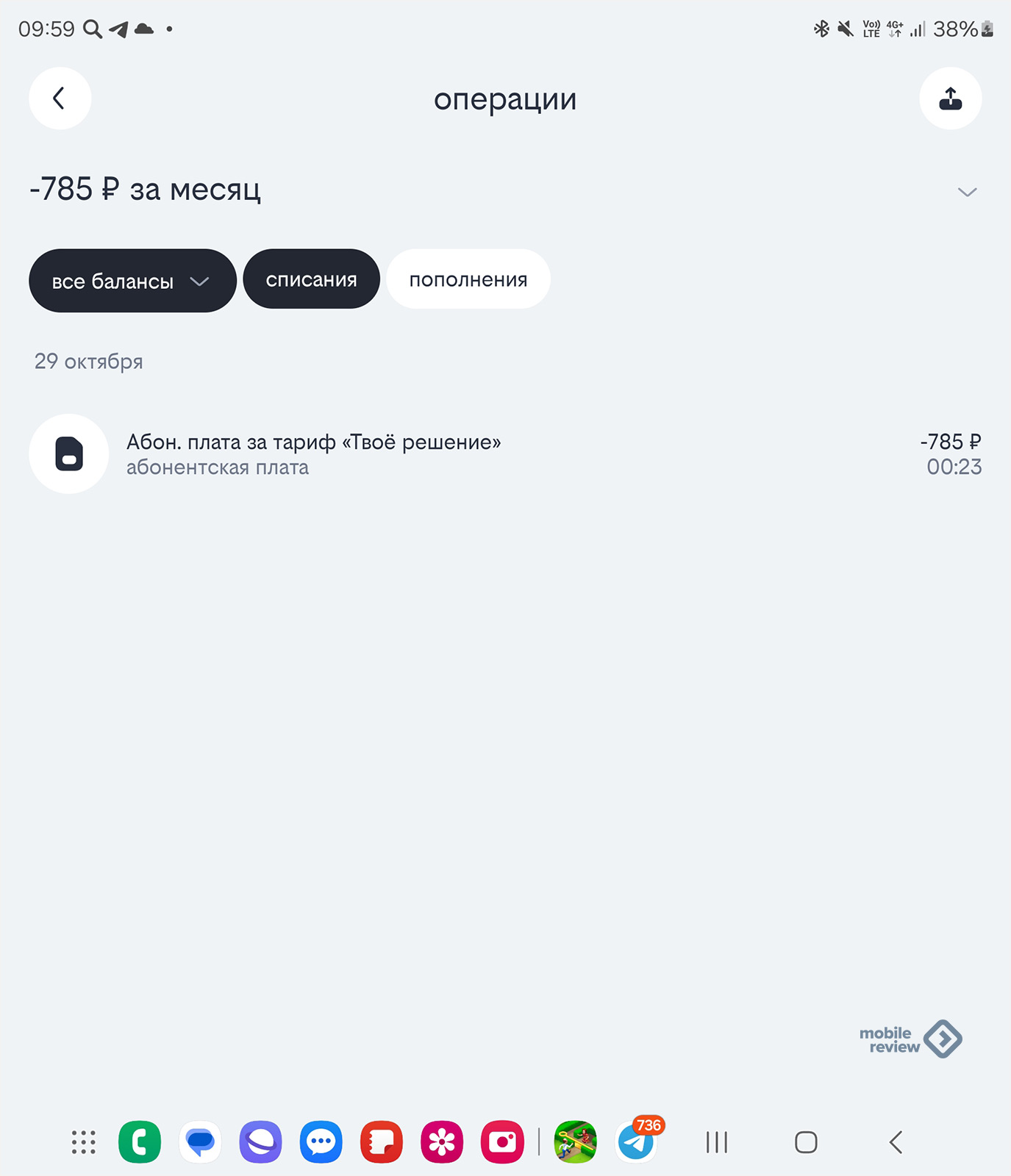
The idea that you need to combine various services in separate cards is not new; we scroll the screen to the right and see the “Details” section, it is the second most popular.
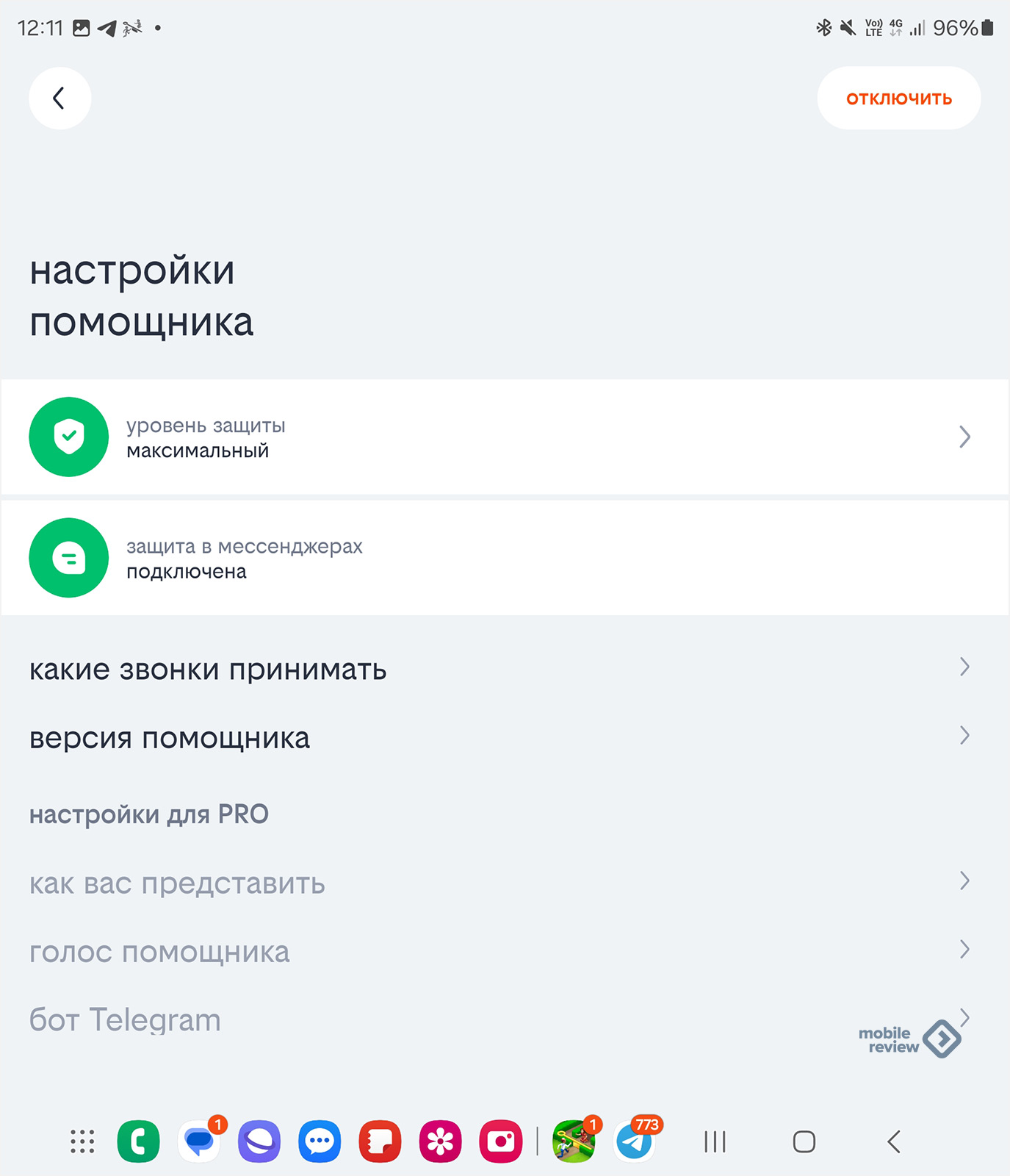
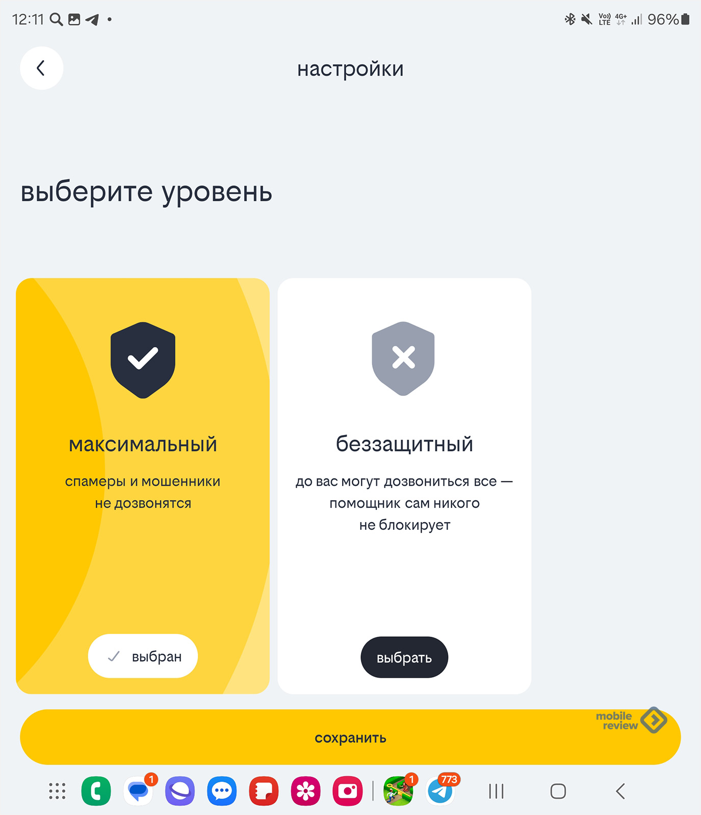
Let’s scroll further, there is protection against spam and scammers, the assistant is free and offers to accept calls from you if you do not answer, or the system assumes that this is an unwanted call. Let me remind you that this protection also works in instant messengers; the application must be given the appropriate permissions.
Another screen is roaming, and it becomes the main one if you are not on your home network.
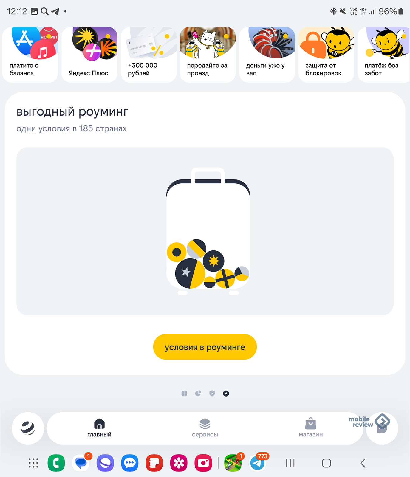
As you can see, the operator in the application has highlighted the main thing, combining it into four screens, some of which can change places depending on where you are. But the long tail of various services also requires attention, and some services are extremely useful for you and me. Hence the line with bright pictures at the top of the screen, certain possibilities are highlighted, as well as the search. But the search is interesting when you come with exact knowledge of what you need.
I’ll tell you a little secret – I flip through applications because I often come across interesting features in them. For example, if you look at the bottom navigation bar, the “Services” button opens a page where various operator and partner services are collected. The idea is exactly the same – to compactly give different proposals, suggest what to pay attention to.
Let’s go back to the main screen and illustrate the point that it is useful to look at what is offered additionally. By scrolling down the screen (yes, you can scroll through it!), you will no longer see the parameters of your tariff and expenses, but various additional services. For example, you can turn on VoWiFi and get an additional hundred minutes of calls to your tariff, they are completely free (probably, you need to make a reservation here that everything depends on your tariff, and so on). Many people don’t know that VoWiFi allows you to make free calls and send SMS while roaming, traveling to other countries becomes cheaper, and you don’t have to spend money on communications. And this option is highlighted for those curious because it is important. In exactly the same way, when you get into roaming, on the tab you will be shown different options available for your tariff and allowing you to save on the Internet and calls.
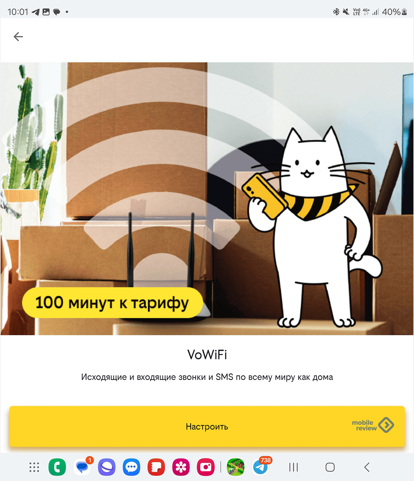
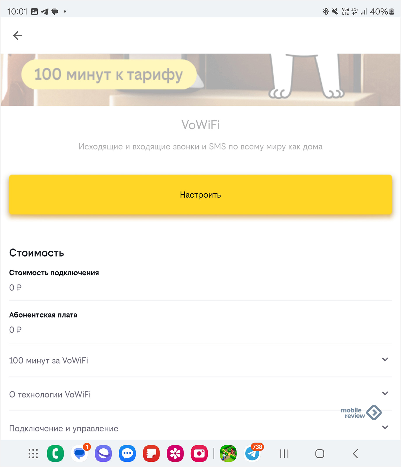
It’s a nice little thing, but it tells you at the right time what useful services you can connect to.
I constantly tinker with different tariffs, look at the offers of operators, but I can say that there are so many of them that it is not possible to remember everything. And this is a normal situation, the operator’s task is precisely to facilitate our communication, to highlight those services that may be of interest to me.
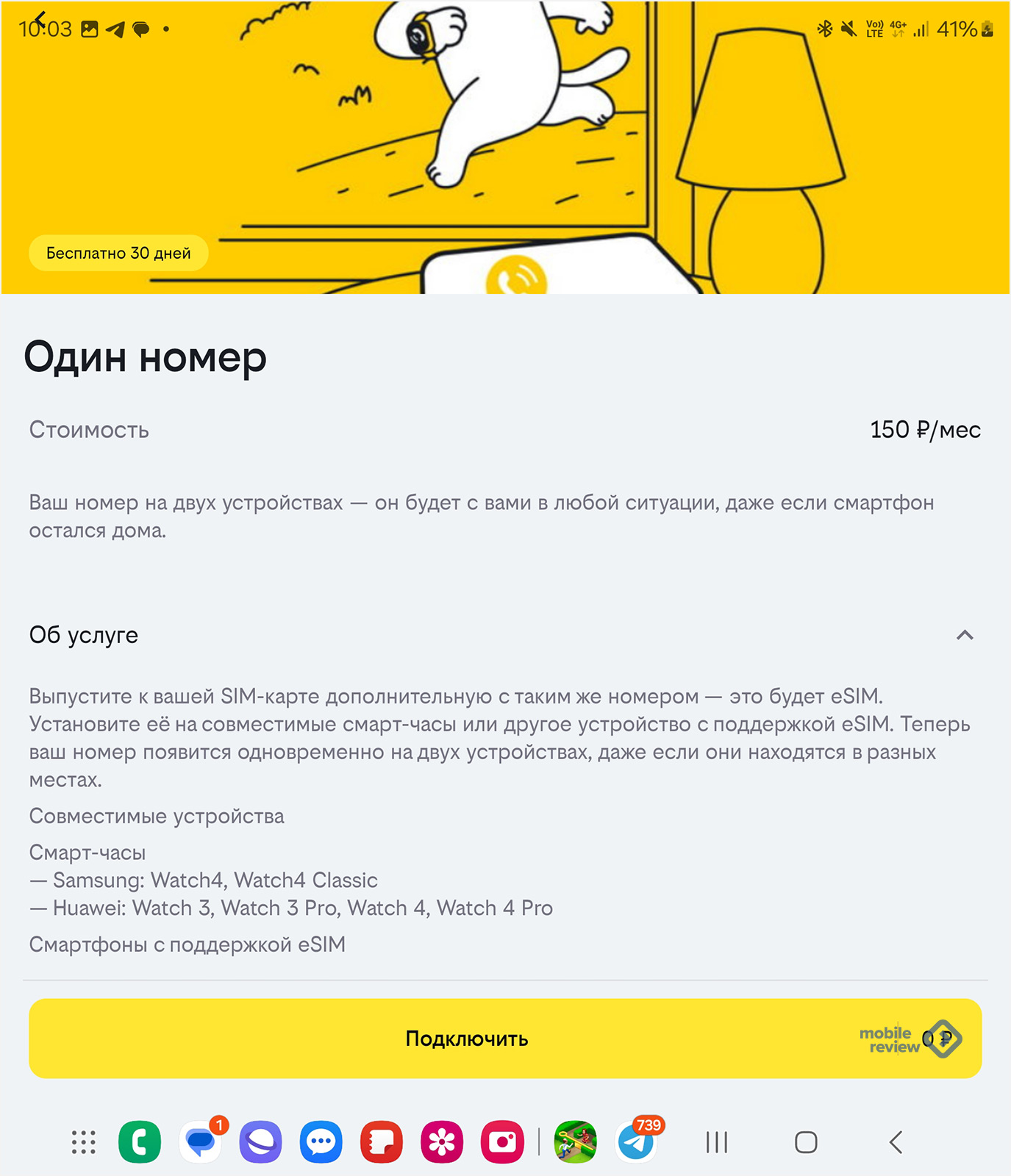
Many people know about eSIM, they’ve probably heard about the “Single Number” service, when you can have a second card with the same number on your smartwatch, receive calls on it, send SMS messages, and so on. For some, this is a convenient option to work with the same phone number.
I completely missed that the service is now available for smartphones that support eSIM, it has gone beyond smartwatches. And the operator’s offer, which I saw in that very application, told me about this. That is, it turns out that I can put an eSIM on a second smartphone and use two devices. One is discharged – no problem, the second one is at hand, and there is exactly the same number. No need to transfer the SIM card or worry about charging. I think you can come up with many more scenarios for using a single number.
The variety of different proposals is duplicated in many places. The task of making the application lightweight and not overloaded is solved by the fact that each screen is generated dynamically. Note the black and white ball with the operator’s logo in the lower left corner. We click on it and get into the cards, where many of the points are already familiar to us.
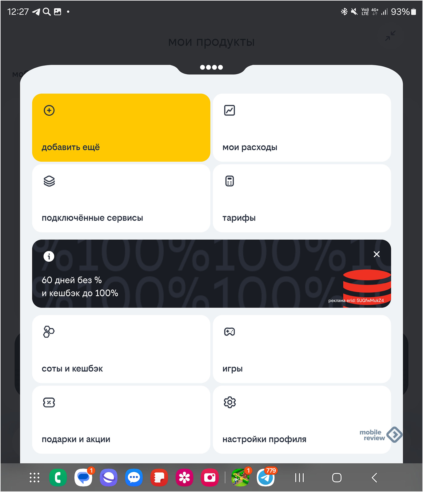
Why duplicate them? The answer is that one application offers different navigation methods, where everyone will choose the one that is convenient for them. This was done deliberately, since today there is no one “correct” path, the user can come to certain services in different ways, the main thing is to make this path easier. And in many ways this also applies to search, which has also been updated to better understand queries, even though they are not always formulated correctly. Here the operator collects statistics about what users searched for in the past and how they asked their questions.
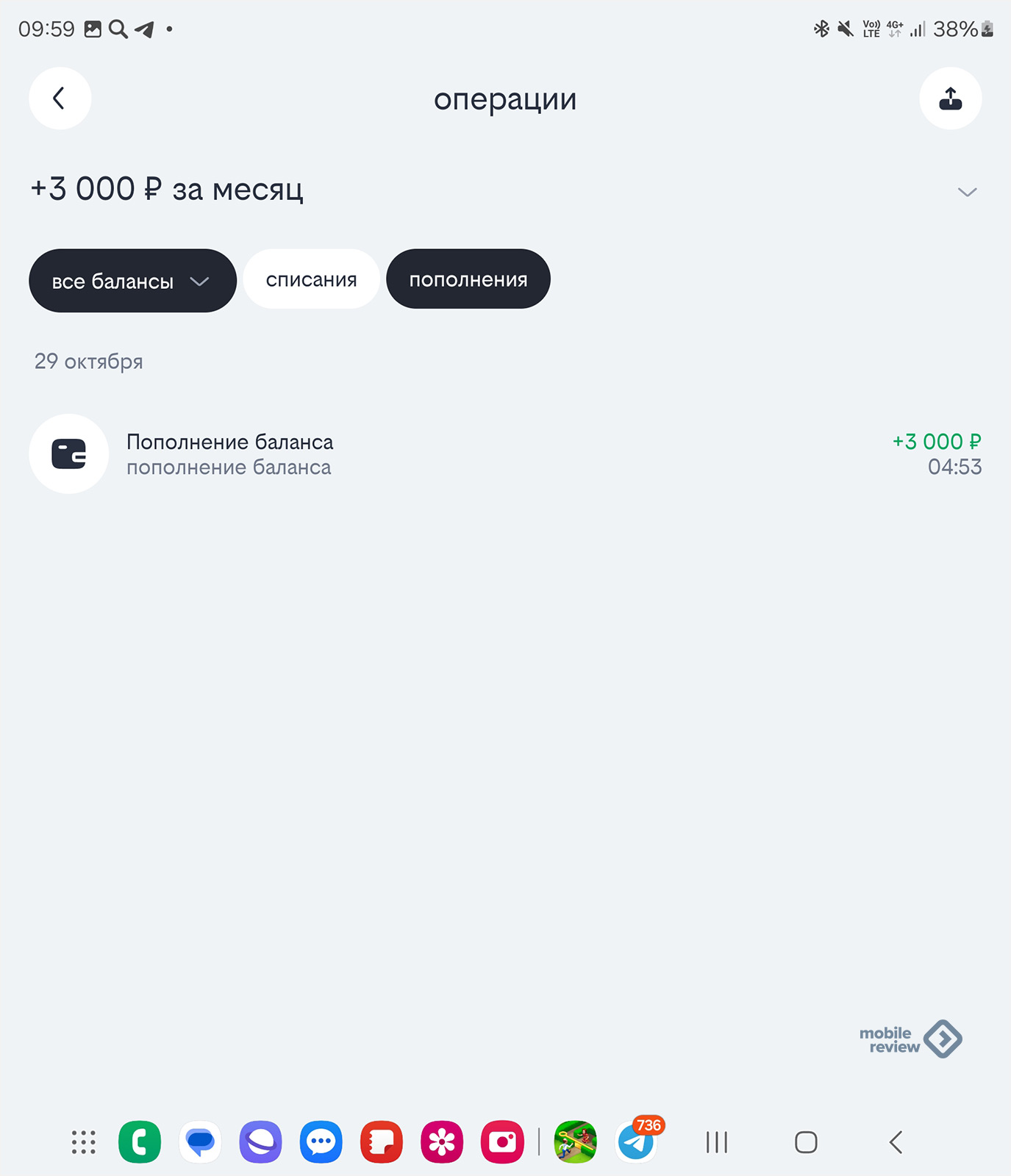
While I was writing the text and taking screenshots for it, I discovered an attraction of unprecedented generosity in the “Promotions” section, spent less than a minute to get 400 rubles into my account (a joint promotion with Yandex). Another argument in favor of the fact that the application is worth installing, as well as periodically looking at it to be aware of how you are using services, as well as what the operator is offering. In the information flow, we often miss interesting offers, and when we find out about them, it is too late, the train has left. Therefore, the algorithm of action for a rational modern person is simple – install the operator’s application and periodically look into it to see what is happening. And without the application, protection against scammers will not work, which in itself is an important component; I don’t want to respond to either scammers or spammers.
Do you have an operator app? Do you look into it from time to time or only when necessary?
Source: mobile-review.com


