Nowadays, your website is often the place where potential customers get a first impression of you. And as they say: the first impression is extremely important. A user-friendly website can make the difference between a customer staying with you or moving on to a competitor. Unfortunately, many mistakes are still made when it comes to the usability of websites, especially by self-employed people and small organizations.
In this article I share the 7 most common mistakes, with practical tips to solve them.
1. Slow loading times
One of the biggest frustrations for visitors is a website that loads too slowly. From research shows that 53% of visitors leave a website if it takes longer than three seconds to load. Every extra second it takes for your website to load means a higher chance of losing potential customers. In addition, loading time is now also an important part of how your website is rated by search engines.
How do you solve this?
- Optimize images: Make sure images are not larger than necessary. A good guideline is to limit images to 500 KB whenever possible. For smaller images, 100-200 KB is often sufficient. There are tools that do this without making the quality dramatically bad.
- Use caching: Caching allows static parts of your website, such as images and scripts, to load faster. This means the server has to do less work and pages load faster.
- Reduce HTTP requests: The more elements (images, CSS files, scripts) there are on a page, the more requests are sent to the server. Minimize the number of requests by combining code or removing unnecessary elements.
2. Unclear navigation
Your website may be visually appealing, but if visitors have trouble navigating the site, they will become frustrated. A confusing or complex navigation structure can prevent users from finding what they are looking for, leading to a high bounce rate.
How do you solve this?
- Avoid too many menu options: keep the main menu simple and clear. Focus on the most important sections of your website and use submenus for further organization. It is wise to limit the menu to 5-7 options in terms of items. This makes navigation easier and helps users find what they are looking for faster. And it prevents it from being ‘overwhelming’, which quickly happens. As a result, people do not make decisions themselves and then leave.
- Use a search function: A well-functioning search function helps users quickly find what they are looking for. This is especially recommended if you have a large website.
- Clear labeling: Use simple and understandable terms for your menu options. Avoid difficult jargon and make sure that it is immediately clear to the user where the mouse click takes them.
A good example of a website that is simple and immediately leads visitors to the most important information, such as prices and requesting a free trial lesson.
3. Poor mobile optimization
In 2024 more than 60% of internet traffic generated via mobile devices. However, there are still many websites that do not function properly on smartphones or tablets. A poor mobile experience can quickly put users off and is increasingly punished by the well-known search engines.
How do you solve this?
- Responsive design: make sure your website automatically adapts to different screen sizes. A responsive website ensures that content is clearly visible on both desktops and mobile devices. With this in mind, avoid large chunks of text and use clear keywords and icons.
- Avoid large images and videos on mobile: Ensure that heavy elements, such as large images and videos, do not load automatically on mobile devices unless the user chooses to do so. A solution to this is to use so-called ‘Lazy loading‘ or have elements load after the user scrolls.
- Test your site on mobile: regularly test how your website looks and functions on different mobile devices. Use tools to check whether your website meets the standards, but above all, spend time clicking through the website yourself. Try to think from the visitor’s perspective.
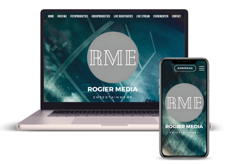
This website shows how a responsive website that is suitable for mobile works. Simplicity and being careful with too many words is the key.

4. Too many pop-ups and ads
While pop-ups and ads can be a way to generate revenue or collect leads, they can also disrupt the user experience and cause irritation. An overkill of pop-ups can irritate visitors and drive them away.
How do you solve this?
- Limit the number of pop-ups: Make sure pop-ups are limited to the most important actions, such as subscribing to a newsletter. Avoid multiple pop-ups on one page.
- Use exit-intent popups: These popups only appear when the user intends to leave the website. This is a more subtle way to grab the visitor’s attention without disrupting their experience.
- Avoid interstitial ads on mobile: Interstitial ads are full-screen ads that temporarily block the use of the site. Google penalizes websites that use such ads on mobile devices.
5. Cluttered layout
A cluttered or cluttered layout makes it difficult for users to quickly find the right information. This can cause visitors to leave the site without taking action. Even this is something that the well-known search engines track and punish.
How do you solve this?
- Make use of white space: white space, also called negative space, is essential to make your website clear and readable. It prevents the site from looking busy and gives the user the peace and quiet to process the content, without being overwhelmed by all kinds of texts and images.
- Use consistent fonts and colors: Keep your website’s style consistent by using the same color scheme and font on all pages. This helps users click through your site more easily.
- Provide clear hierarchy: use headings and subheadings to give a logical structure to your content. This helps users quickly scan and find the most important information they are looking for.
6. Lack of call to action (CTA)
A call-to-action (CTA) is an essential part of any website. It gives users a clear signal on what to do, such as “Contact Us”, “Sign Up” or “Buy Now”. Unclear or poorly placed CTAs can lead to missed opportunities and cause visitors to drop out. Always remember the core purpose of your website and apply it.
How do you solve this?
- Make CTAs stand out: Use contrasting colors to make your CTA buttons stand out. They must immediately attract the user’s attention, without necessarily looking ‘garish’.
- Place CTAs strategically: Make sure your CTAs are visible both at the top of the page and at the bottom after important sections. Also consider the “scroll” of mobile devices. You don’t want a visitor to have to scroll for too long before the CTA is shown. A CTA may occasionally return to the same page.
- Be specific: Use clear and actionable language such as “Start free trial” instead of general terms such as “Click here”.
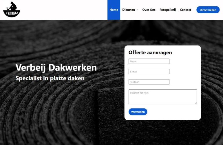
This website nicely shows how CTAs are easy to find and how visitors are quickly triggered to request a quote or contact us.

7. Poor accessibility
An often overlooked aspect of usability is accessibility. A website must be accessible to everyone, including people with visual, hearing or motor disabilities. If your website doesn’t meet accessibility standards, it can not only deter visitors, but also annoy visitors who have actually made an effort to click through your website.
How do you solve this?
- Use alt texts for images: Alt texts describe the visual element of an image and help people with visual impairments understand what’s on the page. They can play this using speech tools.
- Ensure good color contrast: for visitors with visual impairments it is important that the text is easy to read. A high contrast between the text and the background makes this easier.
- Use keyboard navigation: Make sure your website is accessible to keyboard-only users. This means that they can easily access all interactive elements, such as forms and links, via the keyboard.
Get started with these tips to create a functional and user-friendly website.
Source: www.frankwatching.com


